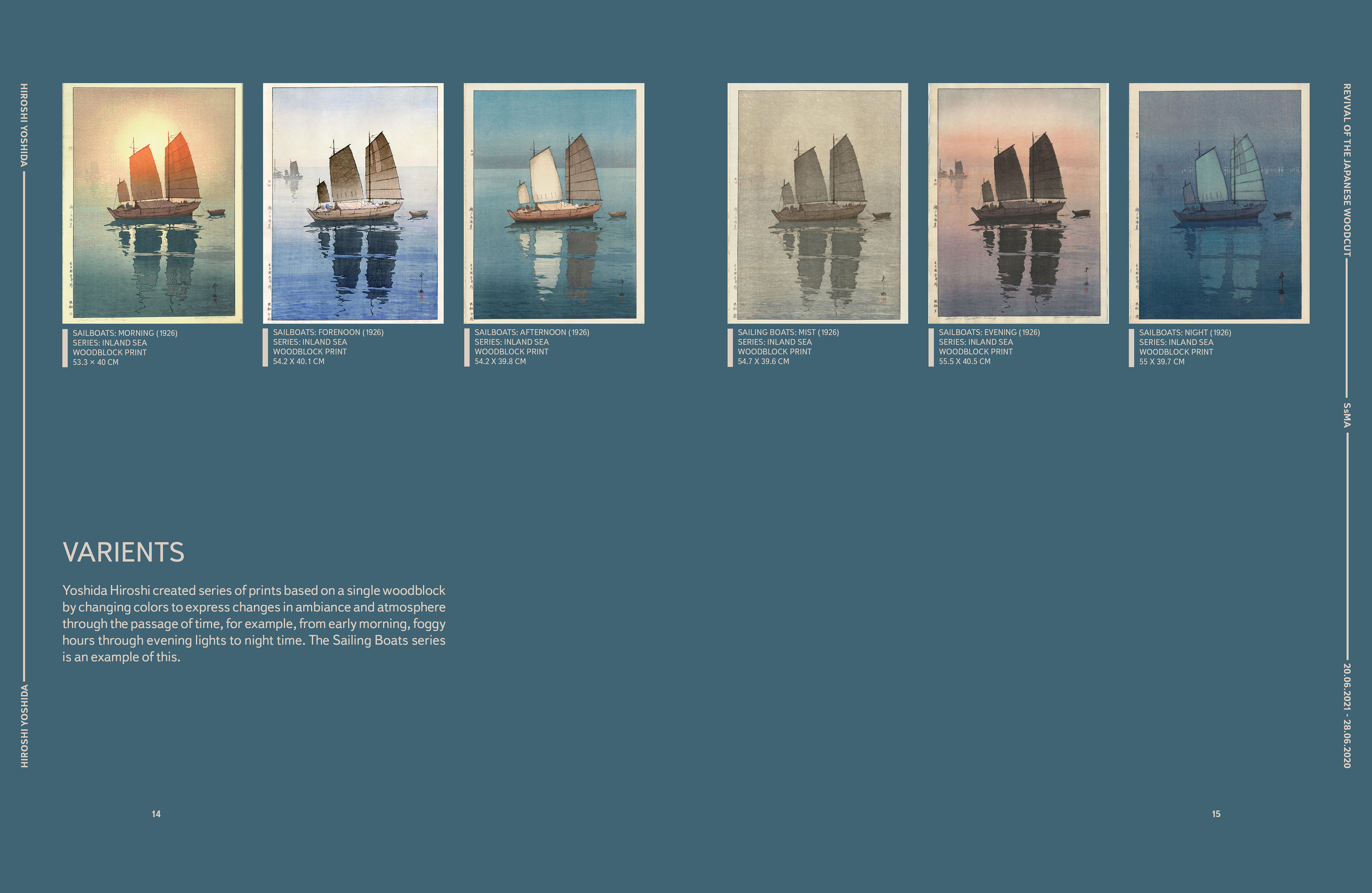
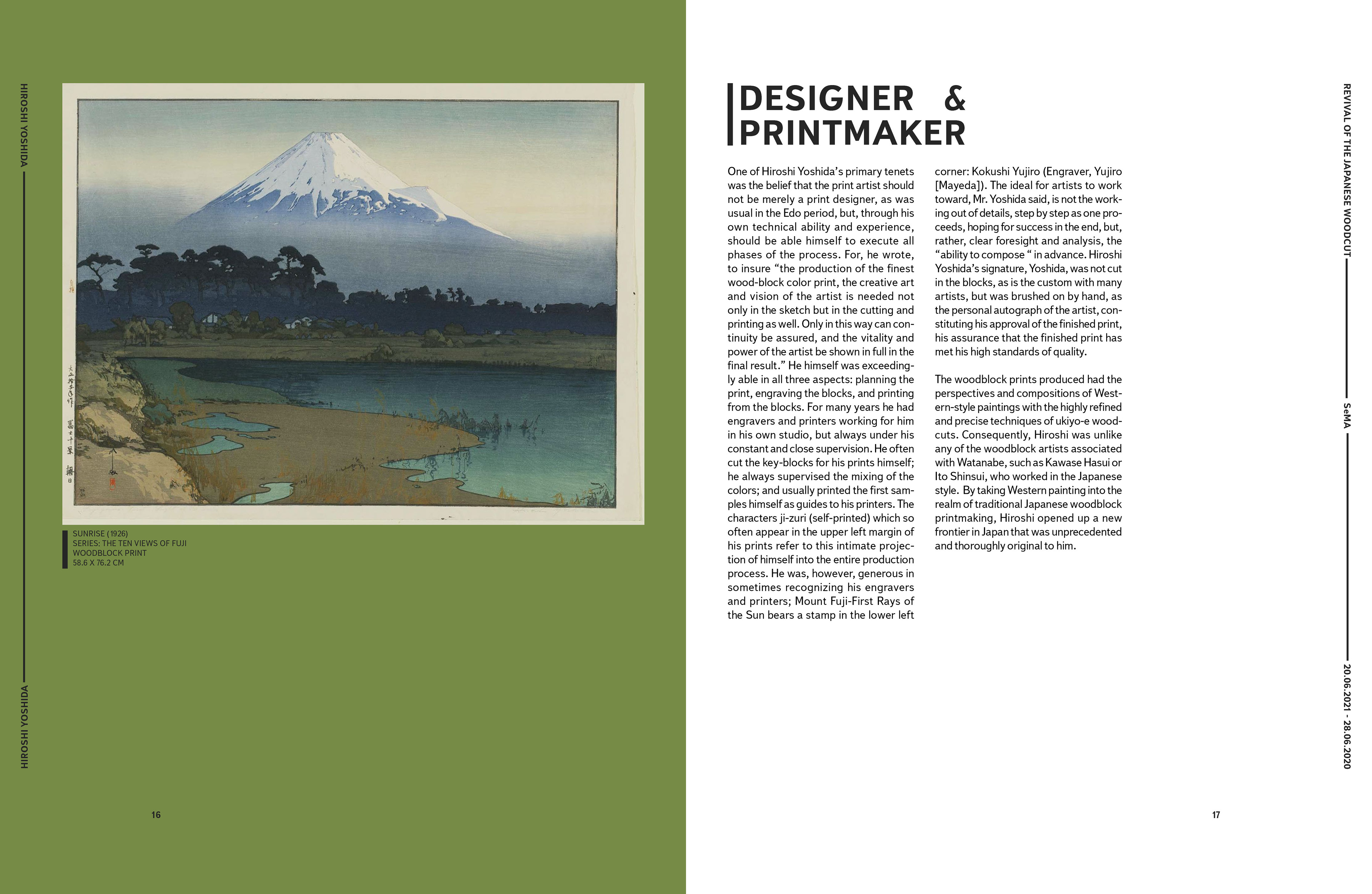
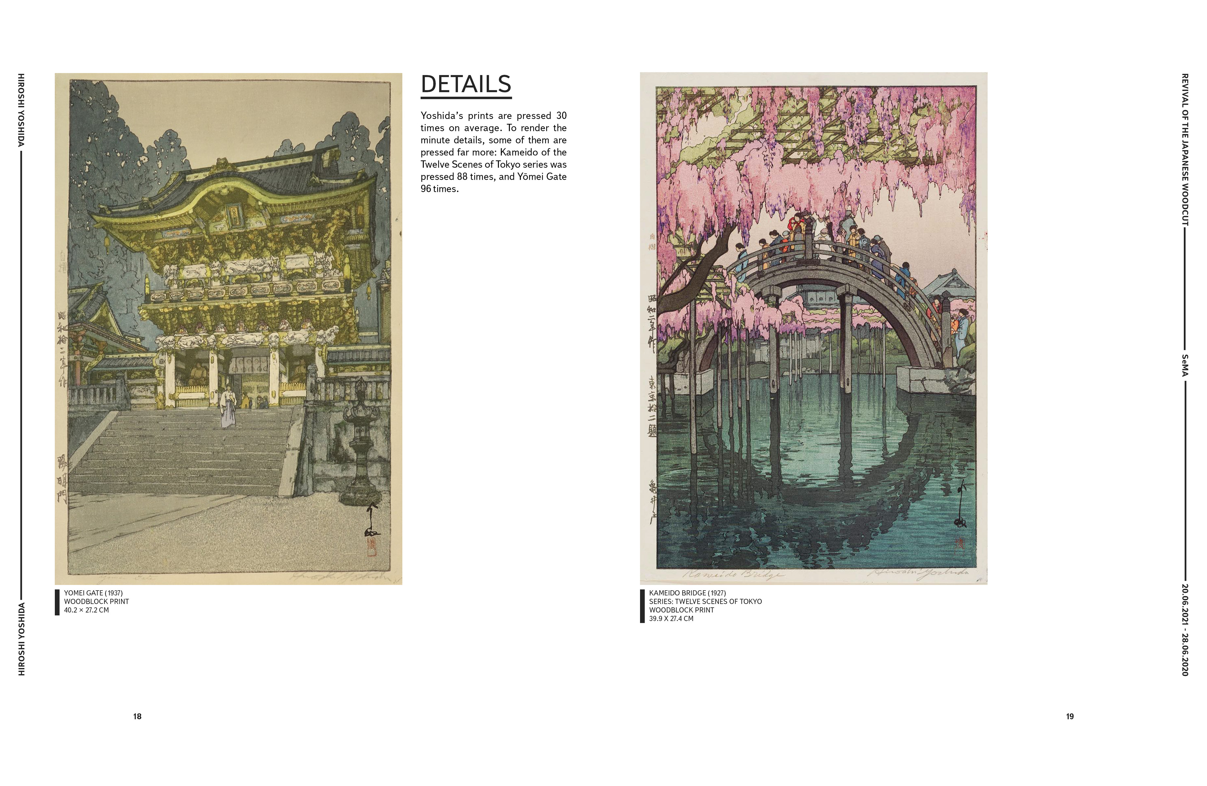
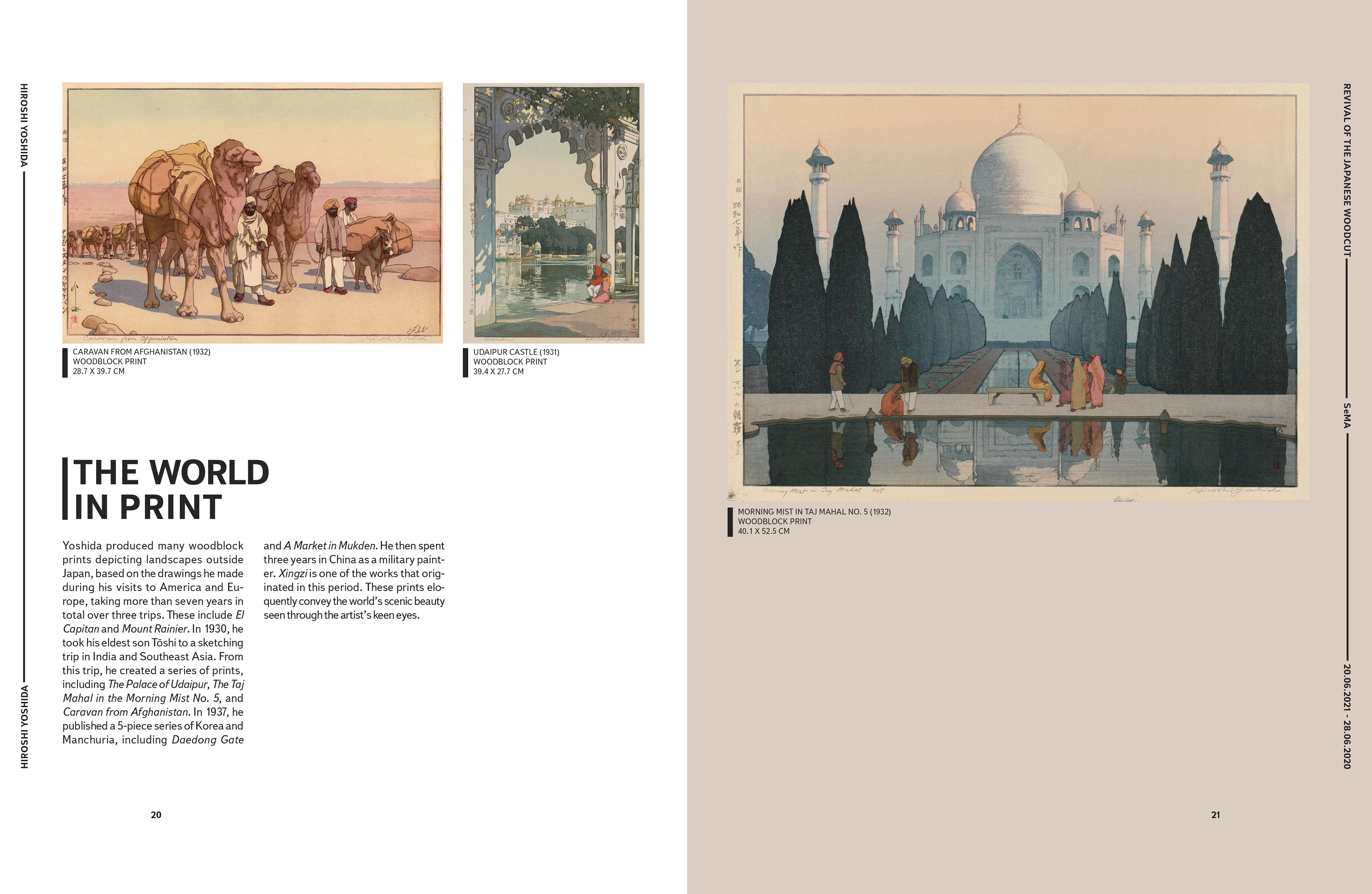


Images and text used for educational purposes only.
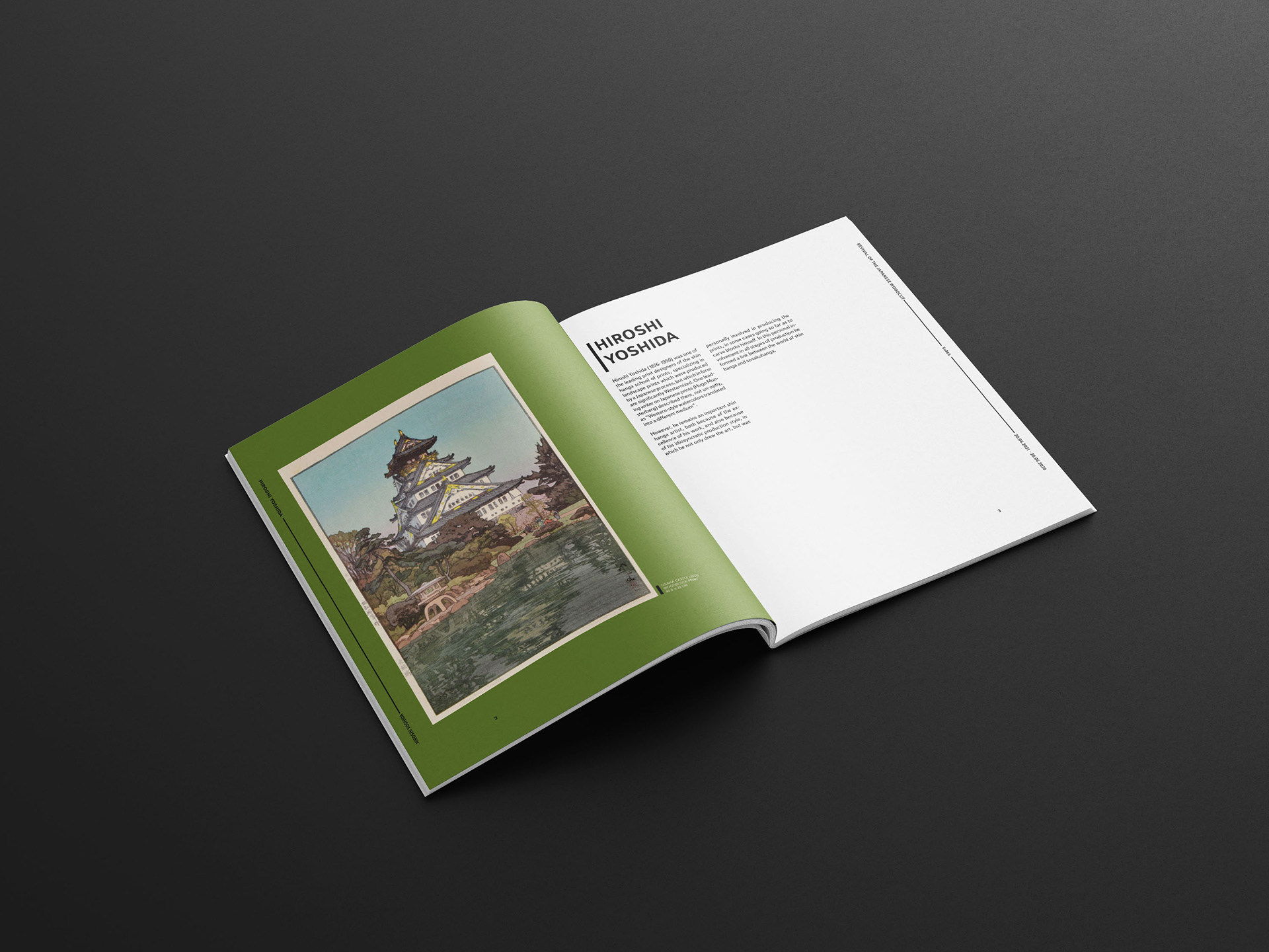
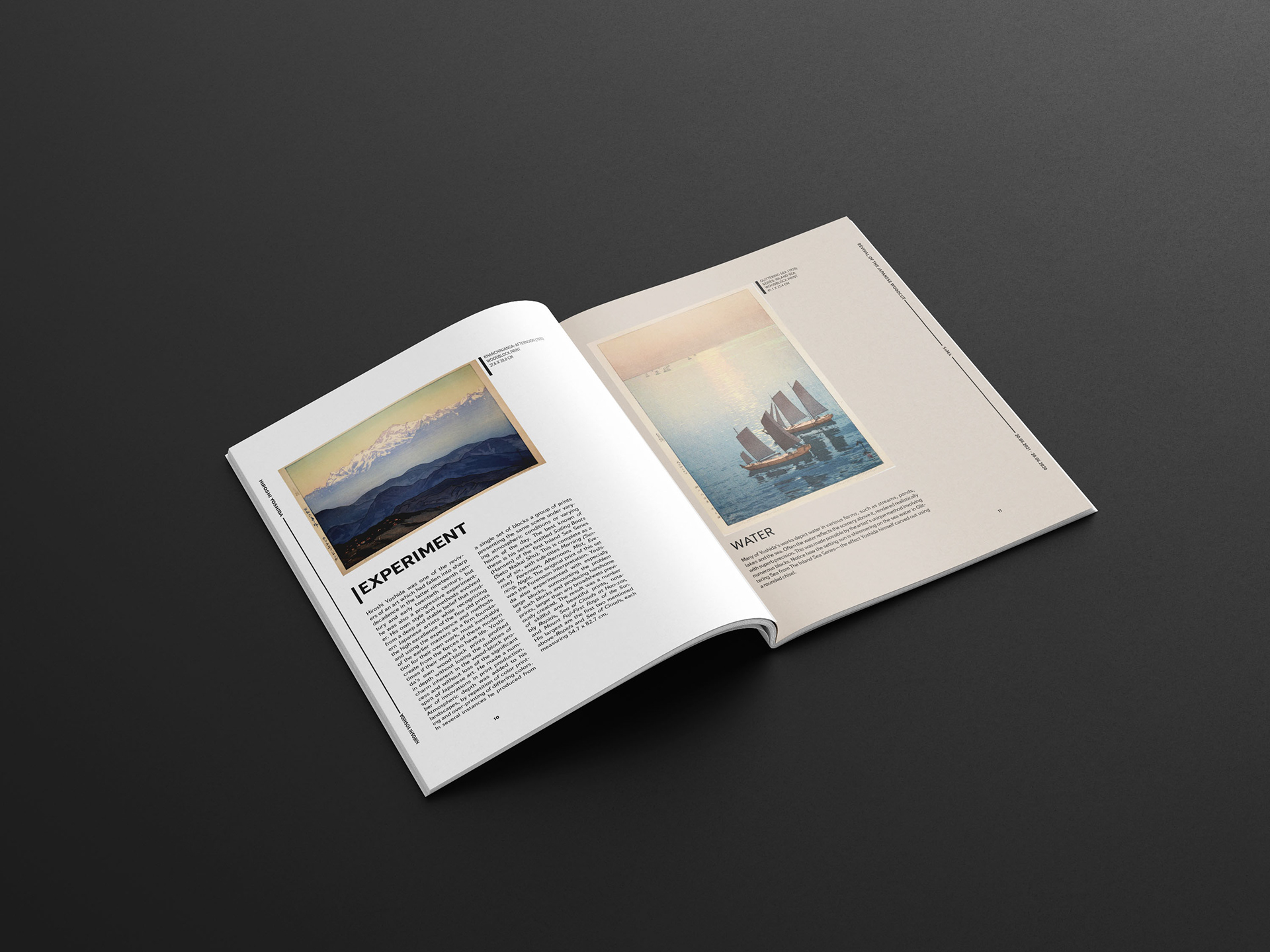
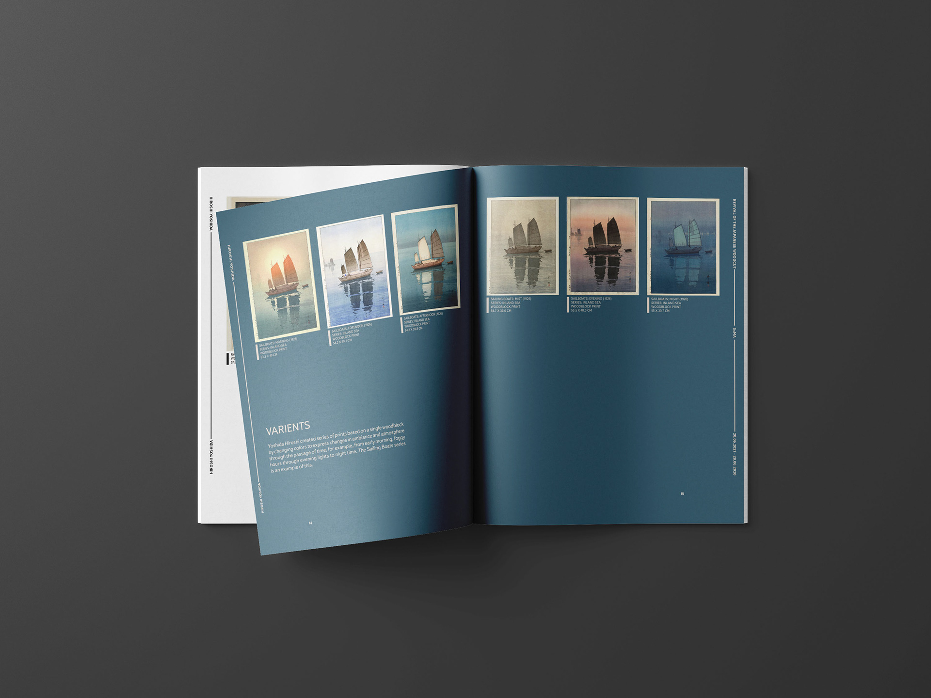
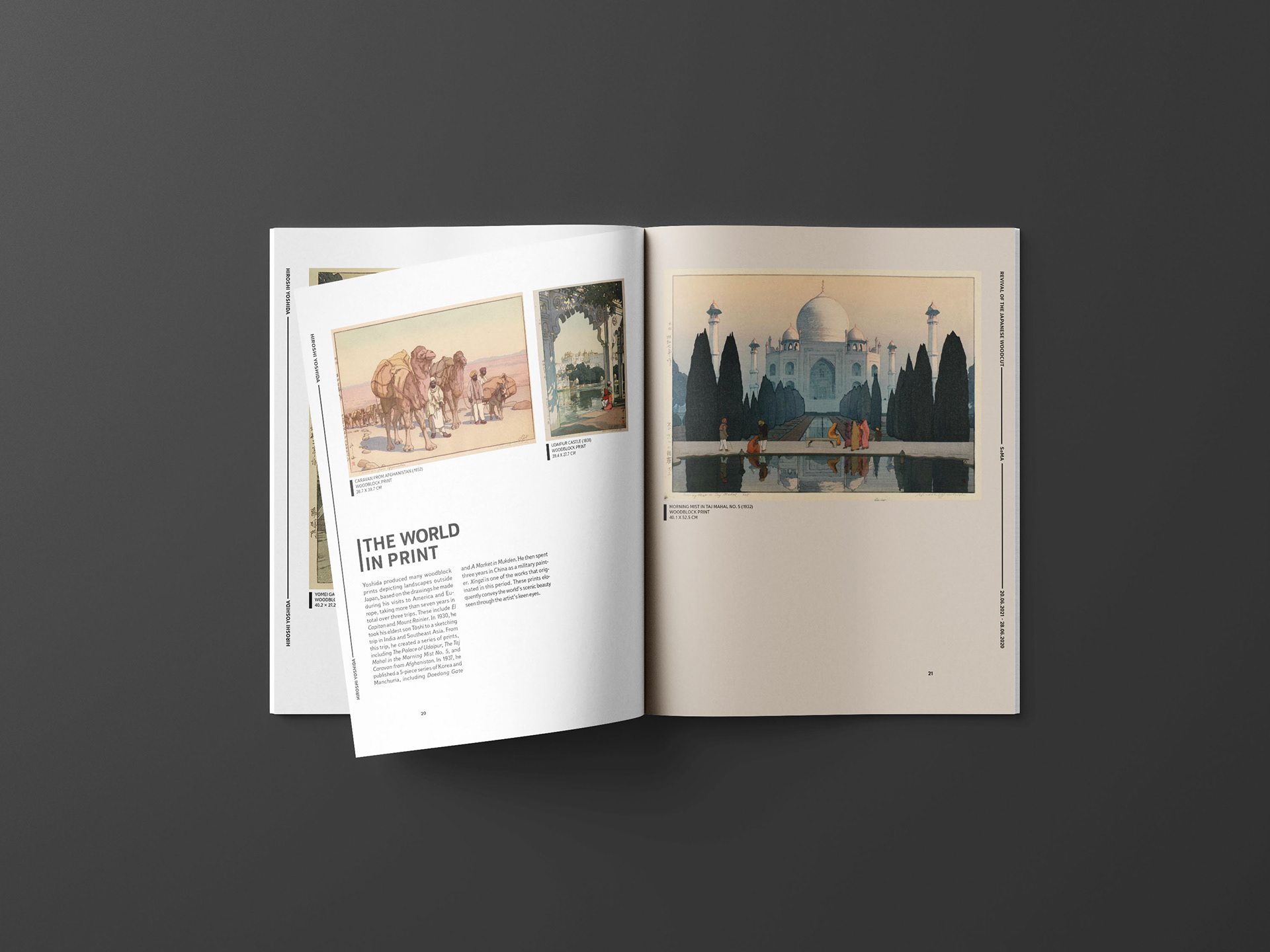
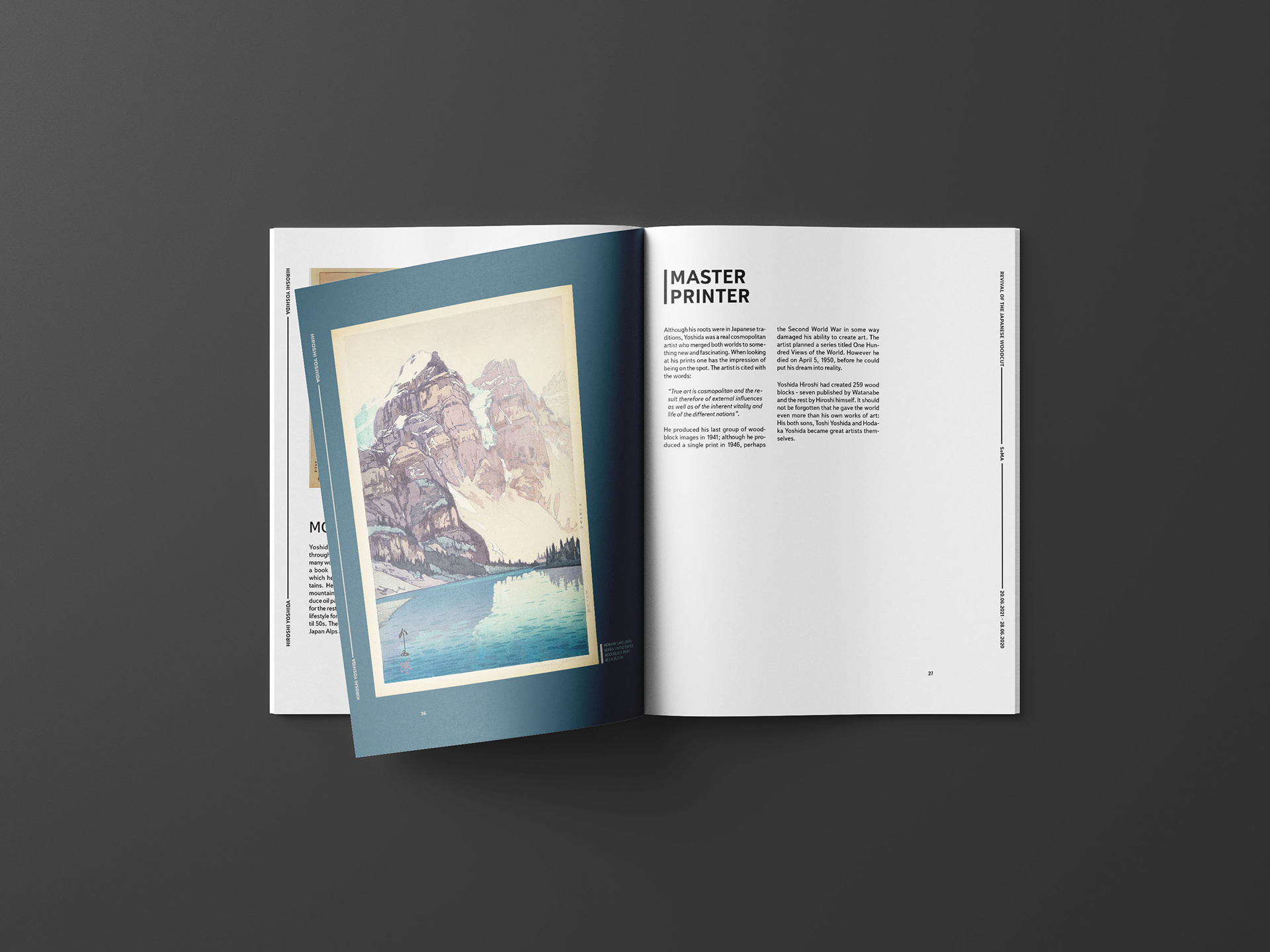
In this project we were tasked with choosing an artist and creating an theoretical exhibit catalogue for them. This project challenged me to combine type, color, content, form, and image into one complete piece. I chose to create a catalogue for a Hiroshi Yoshida exhibit at the Seoul Museum of Art. Which hosts exhibitions for artists of varying ages and backgrounds. Holding the show at this cosmopolitan museum means the catalogue needs to be designed using consistent elements so it is easy to follow. The grid helps keep the catalogue uniform and the added spacing in the margins parallels the spacing around prints. I pulled a bright, earthy color palette from one of the artist’s prints that communicates the nature-focus of the works, but also fits well with the lively, urban environment of Seoul. I would use MOAB entrada rag natural 190 paper for the catalogue because it gives a rich smoothness to colors and would convey the beauty of Yoshida’s prints well.